The multitude of devices and the capabilities of modern web browsers have given rise to many capable technologies. But in most cases they only they create unnecessary complexity, and nightmares to the historians of the future. Evolution is not an endgame, it is a process; ancient sponges can live alongside smarty magpies, and be successful in their own terms.
Going plain HTML is true to the spirit of the early, vernacular web.
Primitivity tells us the story of the browser being not only a browser, but also an editor. Every user of the early web was a producer of web content. Web pages were to be opened in the browser to look at them, but also to edit them, using existing pages as templates for new pages. — Olia Lialina: Prof. Dr. Style
Some are attracted to it’s aesthetics (see Brutalist websites), some champion the principles for a content-first web) again in reminiscence of the Modernists. No matter how you call it, whatever you view on the web is a website.

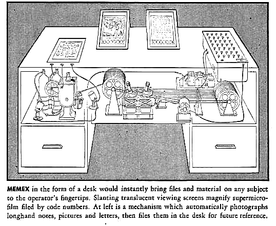
Interactivity is built-in, it’s Hypertext. Nothing good happens on a web of fancy but isolated islands, it’s the bridges you make that matter, ever since the Memex was first conceived by Vannevar Bush a little after 1945, following his famed essay As We May Think.
, upscaled by [Smashing Magazine](https://www.smashingmagazine.com/2020/10/developing-semantic-web/)](../html/tim-berners-lee-web-proposal-diagram.png)
MEMEX in the form of a desk would instantly bring files and material on any subject to the operator’s fingertips. Slanting translucent viewing screens magnify supermicro-film filed by code numbers. At left is a mechanism which automatically photographs longhanf notes, pictures and letters, then files them in the desk for future reference.
There are several calls to the values of the web’s original design, but I am particularly fond of the following one. A fair warning, there’s several f-bombs ahead. Everything on the web is a website, how it ties to other platforms and flows of information is another story:
You probably build websites and think your shit is special. You think your 13 megabyte parallax-ative home page is going to get you some fucking Awwward banner you can glue to the top corner of your site. You think your 40-pound jQuery file and 83 polyfills give IE7 a boner because it finally has box-shadow. Wrong, motherfucker. Let me describe your perfect-ass website:
- Shit’s lightweight and loads fast
- Fits on all your shitty screens
- Looks the same in all your shitty browsers
- The motherfucker’s accessible to every asshole that visits your site
- Shit’s legible and gets your fucking point across (if you had one instead of just 5mb pics of hipsters drinking coffee
If you’re not on a smartphone right now, do click CTRL+U, this will let you preview the source code for this page. That’s how I got to love this craft. I still remember how alien this sequence of codes seemed, it always does no matter how familiar you become with it. It’s not better left for the techies, it’s what our open world of information is built with.